

Eyewear trends for 2026 are pivoting away from stark black toward a quieter, more wearable color language: soft sage, warm sand, dusty rose, honey amber, and milky taupe. Across optical retail and fashion reporting, black is no longer the only “safe” choice on the board. At Concept Eyewear, we see this shift as more than a seasonal palette update—it is how consumers and brand partners want frames to feel every day: intentional, flattering, and aligned with quiet luxury rather than loud branding.
The same year that creamy neutrals and translucent acetates move center stage, smart glasses and AI-assisted wearables continue their climb into mainstream fashion. In fact, the through-line is sophistication. Whether the frame is purely optical or tech-enabled, the winning look favors refined materials, soft color, and proportion that photographs as premium.
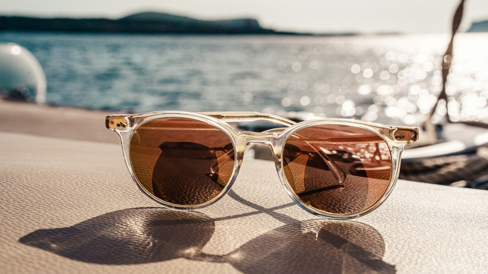
What are the defining eyewear trends for soft neutrals in 2026?
For example, industry coverage this year consistently highlights a “new neutrals” lane. Creamy tones—beige, sand, milk white, and taupe—sit beside muted nature hues such as soft sage, powdery olive, dusty rose, and muted clay. Pantone’s 2026 Color of the Year, Cloud Dancer, a soft warm white, has reinforced interest in milky and crystal acetates that feel airy rather than stark.
For retailers and brand teams, the practical meaning is inventory rebalancing. Classic black remains essential. However, soft neutrals now function as active versatile colors—not niche fashion SKUs. Meanwhile, consumers gain a frame that adds softness without reading as a loud statement piece.
- Soft sage & powdery olive — muted greens that pair with denim, navy, and cream.
- Dusty rose & blush acetates — translucent finishes that flatter cool and neutral undertones.
- Warm sand, beige & milk white — the quiet-luxury creamy family, including Cloud Dancer–adjacent whites.
- Honey amber & lighter Havana — warmer tortoise that softens the face versus heavy traditional dark tort.
Why are soft frame colors replacing stark black?
These eyewear trends show how quiet luxury has changed what “premium” looks like on the face. Minimal silhouettes and logo-light fronts now signal quality more clearly than stark black alone. In addition, soft neutrals photograph cleanly. They also work across casual and tailored wardrobes, and they often harmonize with skin undertones better than a harsh dark rim.
Trend roundups from Vision Monday’s coverage of GlassesUSA.com’s 2026 Eyewear Trends report also place natural milky colors beside quiet-luxury construction. Furthermore, chrome and sculptural experiments still appear at the edges. Therefore the market is dual-track. Soft neutrals stay the wearable everyday lane, while fashion continues to experiment.
How do soft neutrals support gender-neutral and lifestyle eyewear?
Gender-neutral design language—universal shapes, flexible sizing, and shared color stories—aligns naturally with soft neutrals. Consequently, sage, sand, and milky crystal read as wardrobe tools rather than gendered fashion codes. As a result, they are strong candidates for lifestyle and gender-neutral eyewear lines and for partners expanding unisex collections.
How should you choose a flattering soft-neutral shade?
Trends guide the board; however, face harmony decides what gets worn daily. Use this short checklist when evaluating soft neutrals in-store or in sampling:
- Match undertone first. Warm undertones often suit honey tortoise, olive, and sand. Cooler undertones often suit dusty rose, soft sage, and slate-leaning metals.
- Check the brow line. The top rim should track the brow without floating high or cutting low—especially on refined oversized rectangles.
- Test translucency. Semi-transparent sage, rose, or amber can feel lighter than the same hue in opaque acetate—helpful when moving away from black.
- Validate with real wardrobe pieces. Soft neutrals should disappear into jackets and knits you already wear.
- Ask about materials. Bio-acetate and recycled inputs are increasingly expected in premium ranges, not optional niche stories.
Where do acetate craftsmanship and sustainable materials fit?
Color only works when the material can hold depth, polish, and edge quality. Premium acetate remains the hero vehicle for soft neutrals because it carries translucency and milky finishes with tactile richness. Likewise, plant-based and bio-acetate developments let brands tell a sustainability story that matches the calm palette. For related material direction, see our guide to tone-on-tone acetate colours and eyewear manufacturing techniques.
Additionally, for OEM/ODM partners, that means tighter color-matching standards, finish consistency across lots, and sampling discipline so “soft sage” stays soft sage from proto to production. Concept Eyewear works with brand teams on exactly that translation: trend-right color into manufacturable acetate and metal programs.
How do smart glasses and AI eyewear connect to the neutrals story?
Beyond color, eyewear trends also reshape how smart glasses leave the tech-demo phase. As audio and AI assistants move into wearables, fashion acceptance becomes the bottleneck. Frames that look like refined optical product win shelf and street. Similarly, soft neutrals give connected eyewear a quieter silhouette beside conventional frames.
In other words, the soft-neutrals wave and the rise of smart eyewear are complementary. One supplies the aesthetic permission structure. The other supplies new function. Brands that treat color, proportion, and tech as one product brief will be better prepared for 2026 assortments.
Which shapes pair best with the new neutral palette?
Color rarely travels alone. Current reporting pairs soft neutrals with:
- Refined oversized “linear” rectangles and soft squares
- Updated pilots/aviators in warmer metals
- Architectural slim ovals influenced by ’90s minimalism
- Subtle cat-eye variations for fashion-forward customers
Tone-on-tone styling—warm brown frames with soft amber lenses—adds editorial polish without neon drama. Next, pick one proportion that suits the face. Then explore it in two or three new neutrals. Finally, for sculptural silhouettes that still wear soft color well, browse our sculptural acetate eyewear scaling guide.
What should Concept Eyewear customers and partners do next?
If you are refreshing personal frames, start with color: compare soft sage, sand, dusty rose, honey amber, and translucent crystal against a classic black under the same light. Many wearers find the softer palette looks more finished in everyday photos and less severe at the desk.
If you are a brand, retailer, or licensed partner, treat soft neutrals as a core 2026 merchandising pillar. Support that pillar with acetate quality, gender-neutral sizing, and optional smart-ready chassis. Visit Concept Eyewear for ongoing eyewear trends insights, material guidance, and OEM/ODM collaboration that turns runway-adjacent color into reliable product.
Sources informing this overview include Vision Monday’s report on GlassesUSA.com’s 2026 Eyewear Trends findings; Pantone Cloud Dancer optical commentary from OptikNow and Glasses Direct; and independent 2026 trend guides covering soft neutrals, quiet luxury, and acetate fashion. Inventory and brand availability vary.
